Saturday, November 23, 2013

Constructing the View; Perspective.


The subject of the point of view of­­ a photograph and what sets out the photographers vantage point of his subject is one which I find intriguing. Many images of famous places and cities are often reproductions of an original, set out by some postcard portraiture ideal however do they really give us a sense of place of what they are describing or simply form a pleasant image.


 Denis Gilbert recently commented on the disposable nature of digital photography in today's age and how thousands of images can be recorded in a day's work compare to 15 or 20 considered frames of film which are then carefully developed into the finished image. In a profession such as architectural photography the photographer wants to give the viewer a sense of the place which they are looking at without them actually having to go there. How many photographs are necessary to do this? Eugene Atget dedicated the better portion of his life capturing the sense and atmosphere of pre revolution Paris before it was lost forever. Publications such as el Croquis spend a number of days in any one place capturing the sense of place of award winning architecture. What if any is the difference between what the photographer is trying to show us and what the architect is trying to tell us about a work. Can revisiting a project through the unbiased eyes of a new photographer be of advantage to future work.


Based in Madrid El Croquis is a magazine which has been operating since 1982 displaying the works of various award winning architects. Their editions dedicated to Norman Foster, Rafael Moneo and Sanaa can be considered to be the oeuvre complete of these architects and great prestige is attached to an office having a Croquis based on their own work.
El Croquis which translates to English as "the sketch" operate as their name suggests by delivering a quick overview of the office they are examining. They work very quickly travelling as a small group to conduct interviews with the architects and also examine the architect's work. They are very consistent in the quality of their output providing an unbiased first glance of the work of a firm which they feel convey their central style or themes. Using a large format film camera their photographer Hisao Suzuki makes all original photographs for use in each publication.­­­ Transforming their hotel room into their mobile office/dark room they produce a completely original and independent dossier of work on the architects.

In 2013 El Croquis published their 166th edition with the work of London based architects Caruso St John as their subjects. Their New Gallery in Walsall England featured in this edition and is an interesting example of an architect's point of their own project versus the fresh point of view of the Croquis photographer Hisao Suzuki. There is a gap of almost 13 years between when the building was completed and when the Croquis team visited so an interesting comparison may be observed.
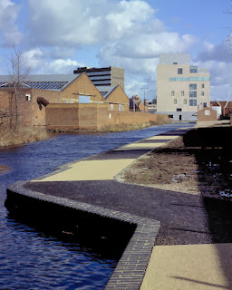
The building itself sits in a rough austere environment flanked by dilapidated factories and a canal recalling a more prosperous time. It asserts itself as a tower among the rusted buildings feathered in green terracotta tiles the project being conceived as a model of quality and good practice about which the rest of the town could evolve. 

The tower is presented by Croquis in punchy juxtaposition with its context, the dilapidated factories providing an almost cultural background to the character of the town. Then Suzuki moves closer displaying the building in its more immediate setting with its modern shopping squares and its metropolitan cafés. Immediately the intention of the project is made clear. Then we are transported inside and are flooded with information on surface materiality and light. Suzuki has carefully considered each photograph as to maximise the information presented in an image. Suzuki takes long exposures creating saturating the images in the gallery spaces natural light and giving a great sense of embodiment and atmosphere to the photographs as blurred figures occasionally move through. Photographing stairways and circulation corridors instils in us a sense of movement and the entire series of photographs give a sense of a journey moving closer into and around the building. The final photograph gives a great sense of closure viewing out a window connecting back on the landscape where the journey had begun.


Croquis' method of concisely summing up the work of Caruso St John in this instance has led the firm to use many of the images in their own publication of the building on their website after the book was released. Having previously relied on largely pictorial renders and architectural drawings to describe the work it is certainly a compliment to the work of Suzuki and the Croquis team. 
The Fidelity of The Image

In November 2012, press photographer Paul Hansen was in Gaza City when Israeli forces - in response to Palestinian rocket fire - bombed the city. Hansen captured this photo in an alleyway in the aftermath of the bombing. The photo shows two of the casualties of the strike being carried to their funeral by their uncles. The potent blend of fury and despair resonated with many the world over  and the image won photojournalism’s most prestigious prize - the award for World Press Photo 2013.


However, even an untrained eye can tell there is something amiss with this picture. The dramatic quality, which makes photo stand out from the crowd, makes it seem cinematic and slightly unnatural. For example the man to the left of the photograph seems to be illuminated from the side, despite being tight against a wall in a narrow alley. Journalists and some pro-Israeli bloggers accused the photographer of embellishing the photo. Some went so far as to suggest it was actually a composite of many images.

To quell the rising controversy, the jury employed a team of forensic analysts to examine the photo. By examining the shadows, and by pulling the metadata from the file, the team were able to examine how many times the photo had been altered, and through an analysis of pixel change they could see which areas of the photo specifically had been altered.

The conclusion of the jury to this was that the photo had indeed been altered, mostly filter changes and some (arguably excessive) dodging and burning, but not to the extent that the integrity of the subject matter had been compromised – the jury was given a copy of the original RAW file for comparison. Deciding to stand by the image, the jury insisted it holds entrants to the same retouching standards as news agencies – for example, AP only allow enhancements that are possible in a darkroom with film.

However, the whole episode has called the ethics of retouching photographs into question. As photography becomes more and more prevalent, many photographers have been accused of looking for ways to make their work stand out from the crowd. This, combined the ready availability of Photoshop has lead to a marked change in press photography in the past few years, a change which becomes noticeable when current winner is compared to the winner of the same award from 10 years ago.


But this practice is widespread. A Rome based firm – called 10b – claim that during the course of their their work, they can exchange up to one hundred different emails with photographers instruct them on how to work on every last detail. One example they give involves adjusting the saturation of blood, so it conforms with the viewers expectation of what blood looks like.

But how much is too much? The level of alteration a photographer can perform on his work is an important question to consider when we consider the importance of press photography in impartially recounting events. Only recently are the general public starting to become more wary of photography. Traditionally, photography was seen more as an almost scientific method of producing images which were completely faithful to reality.

But then again photographers and editors have always had other ways, to alter photos to suit their desire The very act of taking a photograph involves framing a sliver part of the world, freezing it at a certain time, and removing it from its context. 

The work of Jules Spinatsch looks at what he describes it as “the gap between what [the photographer] wants, and how the audience reads it’.

Calling into Robert Capa’s adage, “If your photographs aren't good enough, you're not close enough”, Spinatsch to maintain objectivity, you must keep your distance.
Photographing the security and military mechanisms around world summits and the ensuing protests – possibly the most politically and emotionally charged subject imaginable - he turns his back to the action, producing unpopulated, contemplative images. A counter-point to the emotive crowded type, which traditionally circulate whenever a protest occurs.


In his view, the sometimes tightly controlled, one-sided nature of photography
highlights the idea that the motivation behind the photograph is more important than the content.

If only he could give his camera to a motive-less robot, and let it do the work. Which is what he did.

His large panoramas, which are taken by an automatic rig, incrementally surveying a scene, frame by frame over the course of the day, effectively removes his input into the framing and the timing of each individual photograph. Indiscriminately taking a picture of everything, at every time, creating something that it could be argued, it closer to an honest look at the scene.

But perhaps you could achieve the same effect by not removing the photographer, but instead by exponentially increasing the number of them, which is what has been happening globally through social media? To put it into perspective, for every minute that passes, seventy-two minutes of video are uploaded to YouTube, every second 3,500 thousand photos are added to Facebook. Could these provide an impartial, penetrating view of the world around us?

This huge democratisation of photography, through camera phones and social networks makes photography an even more potent agent of social change that can transcend media-blackouts and censorship. From chemical weapons, to hospital dinners, this new phenomenon has proven its ability to seemingly expose the truth, and effect real change.

The reality is, because of its nature, the Internet provides an equal platform to all of this content, regardless of its honesty, content, or editorial oversight.

Dublin-based organization Storyful has sprung up in response to this deluge. Describing themselves as ‘the first news-agency of the social media age’ they filter online content to separate – in their words – ‘filter breaking news, trending stories and local sources from the noise of social media.” 

Acting as online sleuths, Storyful independently verifies photographs and footage that is circulating on social media. Their work involves examining the content, cross-checking usernames with local directories, and social media profiles, checking background features against with maps and satellite imagery  and conditions in the images with weather reports. Looking at their list of esteemed clients, the New York Times, Reuters The Economist and The Wall Street Journal to name a few, proves that the big names in news realize that this has potential.


If your photographs aren't good enough, they're not big enough.

I've started looking at the size of photographs, in particular large photographs and their content.

Thomas Ruff, Untitled exhibition 
Andreas Gursky

Two artists that I will focus on are Andreas Gursky and Thomas Ruff. Both these artists studied at the Saattliche Kunstakademie in Dusseldorf under the tutoring of Bernd and Hilla Becher until 1897. Others in this class were Thomas Struth, Candida Hofer, Axel Hutte and other photographers that have had very successful careers. The reasons I mention these photographers is that they have stayed within what I would call the conventional sizes of photographs yet were taught by the two Bechers. Although influenced by the Becher's linear black and white depictions of machinery and architecture, Ruff more so in terms of architectural photography, the two photographers went in an opposite directions. I hope to understand the significance of the large photograph through comparing Gursky and Ruff. Is conveying a meaning to the viewer something that small scale work cannot do?
Gursky moved into the world of humans and then removed himself as a 'photographer'. I know I’ve included him in the Becher School of photography but as Rupert Pfad puts it in his text for ‘Andreas Gursky’ that …’he has long since developed his own independent visual idiom… liberating him from the precepts of his teachers’. Themes in his works are hard to discern. Once he finds a subject that interests him, he chooses carefully how to portrait it rather than developing a theme or photographing a subject ad nauseam.

So far in my study of Gursky’s work three styles have emerged to me. These styles of photographs are merely vantage points over his intended subjects. One is where he is at a height above the subject, almost a birds-eye view. This allows the scene to be spread out above the picture plane and the horizon, that’s if there is a horizon. In these images Gursky is removed from the subject matter but there is always a hint that he is still on this world looking onward as in Bundetag. The second is where the subject is parallel to picture plane, spread right across the frame and has an indefinite quality to it. Examples that best describe this would be his Prada photographs that resemble an advertising style and Paris, Montparnasse where he depicts the regularity of design but also with great detail showing the modular differ due to human activity from apartment to apartment.

Gursky, Bundetag
 These two distinctive styles have been commented on by Lynne Cooke, in her text for ‘Andreas Gursky’, and are well noted. She also comments on a third group featuring diptychs and triptychs. I, however, feel that these are generally comprised of the first two styles. A third grouping which I feel is note worthy is in Gursky’s ‘Brasilia, General Assembly’ collection. The criterion here is a close up view of components where his motif of anywhere and everywhere comes through quite strongly. ‘Untitled III’ also fits this third group on for size. In its depiction of the gravel on the road seems monumental due to the low angle from the bottom right. The long shadows intensify the scale of the subject. I feel this third group might be a by-product of the large size which Gursky prints at.

Gursky, 'Brasilia, General Assembly II'

Thomas Ruff

In the work of Thomas Ruff, compared to Gursky, there are many themes to explore. However, I will not stray too far from the photographic themes which Ruff chooses to show in the larger scale.

Ruff has, again like Gursky, a different role in the Dusseldorf School when grouped with the students of Bernd and Hilla Becher. This largely due to his approach to subject matter and his predominate use of digital techniques.
In ‘stars’ we are shown romantic images of the universe but with further knowledge of the images the photographs have not been taken by Ruff. They have been taken by the European Southern Observatory in Chile and because these images are not his, he creates a radical abstraction from the enlarged prints.

Following this theme of the artist’s withdrawal from his work, two works of Ruff’s ‘Nudes’ and ‘jpegs’ offer us an insight as to why Ruff prints on a large scale. In these two series he intentionally uses freely available images sourced from the internet. The images are then distorted because of their enlargement. The larger they are the more distorted they are, this then gives rise to the subject matter of the image and a question; 

is the original subject lost, changed or still there?

Ruff, 'Jpegs'

Large Format

Together Gursky and Ruff have moved into the realm of the larger print at around the same time, late 80’s, this could be to do with the development of their works as they both came from the same class in the Dusseldorf school. Another reason might be due to technological advances in photograph and also in printing techniques. (This is an idea that with advances in technology we get advances in photography. A common theme amongst the two Germans and one which I would like to touch upon in my main essay.)
The issue, I have, regarding Gursky’s ‘Brasilia, General Assembly’ and ‘Untitled III’ and Ruff’s series of ‘Jpegs’ and ‘Stars’ is did these photograph develop into large format prints or did the subject matter inform them. In the case of Gursky going large comes from the search for more detail to be shown to the viewer. A mesmerizing level of detail that does not let the viewer focus on a particular subject. Ruff on the other hand uses the size of a print to reinforce his subject matter.

Going back to my original question of can the small scale represent the ideas of Gursky and Ruff? Would their work be that different if confined to postcard size? The title of this essay, from a Robert Cappa quote which he made with regards to being close to the action of the war, I feel, is why the large format does for Gursky and Ruff. The action that is, not the war. The monumental size says ‘look at me I am important’ yet both artists choose to convey typical scenes. Not surreal images as with the Pop art movement producing large prints, e.g. Warhol, Liechtenstein and Rosenquist. The large prints are an experience which unlike conventional photography is not about remembering the past or documenting an event but experiencing the present. This experience for the viewer is limited to the space where the prints are shown and thus is a main reason Photographers ‘print big’. It is for the viewer of the work to experience what the photographer intended.


 In the case of Gursky and Ruff this is usually to challenge the viewer. Even if this challenge is to the conventions of the viewer or not, there is no doubt the issue of the larger prints have more to them than just size.

Passing Through

There is an idea of movement in both Alec Soth’s Sleeping by the Mississippi  and Joel Sternfeld’s Oxbow Archive that I find compelling . Sleeping by the Mississippi  references this majestic body of water deep with historical references and literary narrative winding its way through the Midwest. The feeling  of power and visceral movement which sweeps with it through Soth’s home town proved an allure too difficult to resist. We rarely see the river in the body of work, however the feeling of transience and transition is tangible in the images; as the river moves, we move. The youthful endeavour of Alec Soth - characterized in the Hucklberry Finn tale of boyhood wandering - to follow this boisterous river and photograph the places and people that inhabit its shores is easily juxtaposed against the maturity and restraint of Sternfeld’s Oxbow Archive.


It is useful to think of the river in a metaphorical sense - Soth’s  Mississippi  flowing with purpose and intent, eager to move on versus the idea of the ox bow lake - a result of a settling of sediment and erosion over time, that turns inward on itself, detaching itself from the feverent flow of the river. Sternfeld embodies this sense of process and passage of time in this mature body of work. A master of social document through wandering himself - the sense of movement in the images is innate. The passing of seasons and the changes it brings are frozen in time to produce a social document of a different kind.  


With both Sleeping by the Mississippi and Oxbow Archive exhibiting an idea of movement, it is interesting to explore the role the 8x10 view camera plays in this. The use of an unwieldy view camera feels decidely counter-intuitive to the idea of capturing images while roaming the landscape. Soth claims the 8x10 made the process of wandering and meeting people less ‘predatory’ as he often left the view camera in his car and sets off with an open mind. In this way the limits of the view camera, in that it is cumbersome, pedantic and labour intensive to set up, releases something in the photographer. To limit one freedom is to release another. Liberated from the urge to capture a feverent twenty frames per minute it allows the photographer to look, and to really see.


One can imagine the rigorous process of ‘setting up’ the view camera as a ritual of sorts – a solemn ceremony consisting of a series of actions performed according to a prescribed order. Patience and diligence exhibited in the process of manually setting up the camera are again shown in the process of setting up the image. To undertake this lengthy process also displays a personal confidence in the image they are about to capture - a worthiness. The view camera with all its intricacies and limitations, and the notoriously complex focusing process, serves to slow down the photographer to really evaluate the image they are about to capture. Seeing the image slowly registering on the ground glass - albeit upside down and back to front -seems to me another ritual which couldn't but help to sustain a photographers affection for the medium. When Soth speaks about the view camera, with all its quirks and limitations, there is an overwhelming sense of respect and affection. His description of the image appearing on the ground glass as ‘jewel-like’ that is sometimes so beautiful he almost refrains from capturing the frame betrays a novelty and a fascination that the view camera would bring to every exposure. 


Soth claims that he is not the kind of photographer that waits around for the optimal lighting for a shot– and there is something about the necessity to keep moving which underpins Sleeping by the Mississippi that makes me believe this. But there is also an underlying sense of patience and tranquillity rooted in Sleeping by the Mississippi that conveys a sense of care and craft which the view camera demands. This idea of time or indeed urgency and the knowing of how long it takes to expose these images add to the depth of the photographs. The astounding depth of field in both Sternfeld’s Oxbow Archive and Soth’s Sleeping by the Mississippi is the obvious draw of the view camera but I also find the idea of time and compression of time into one image fascinating. In Sternfeld’s Oxbow  Archive - the culmination of an almost hermitic plight over  eighteen months - it is the clarity and detail of the images that captures our attention at first. But as one becomes drawn into the book it is the compression of time evident in his images that sustains us. The passage of time and the impact of the seasons on this unremarkable potato field is clearly an interest that sustained Sternfeld. It is interesting to view Sternfeld as the farmer of this field, gaining his sustenance from the working of the land. He came to know the land intimately - as meticulously in tune with the processes of the land and the weather as he was about the processes associated with the view camera. Capturing the changes of seasonality was driven by a sense of urgency, a sense of the expiration of the image. This is the last time we will see the landscapes quite like this. This, the inevitable ending of things, captured with a quiet dignity and restraint. Sternfeld visited this site on his previous wanderings for American Prospects, but his return marks a more mature piece work - the pace is different.  The inclusion of the map at the end of the book signals that he wants us to relate, to imagine that we too could return to these places captures in his photographs, although always with a knowing that these exact images will never truly be seen again.